
Presentation Philosophy
Word as light, image as prism
A slide deck must never serve as a teleprompter. Instead, treat your slides as an emotional and artistic prism for the spoken word’s light. I reject the clinical, crowded templates that reduce ideas to flat bullet points. Think of the screen as a theater. Let the image do useful work, working in tandem with your voice to build an atmosphere. When word and image merge, they open a space where true insight emerges. Do it well, and you invite the listener to engage their own creative intellect.
Humans possess visual brains. Science shows that we remember information much better when it pairs with an image instead of just text. Audiences cannot read a wall of bullet points and listen to a speaker at the same time. If they try to do both, they experience cognitive overload, meaning their brains lock up and check out.
Good stories and strong images stir the heart. Long after the audience forgets your exact words, they remember how your presentation made them feel.
Many presenters miss this simple truth. As a result, the business world is drowning in flawless but soulless AI pitch decks that say nothing. This algorithmic emptiness leaves audiences exhausted.
My work is the cure. I strip away the noise to offer human connection, deliberate pacing, and visual focus.
The Architecture of the Live Keynote
There are two types of slide decks in the professional world: the Read-Ahead Summary and the Live-Performance Architecture.
A Read-Ahead Summary is a document masquerading as a slide. It is packed with crowded text, flat bullet points, and sterile data metrics meant to be read alone at a desk. If you project this onto a screen during a live presentation, you invite immediate cognitive overload. Your audience will look up, read ahead, lock up, and completely check out from your voice.
I do not build Read-Ahead Summaries.
I engineer Live-Performance Architectures.
Designed exclusively for high-stakes keynotes, venture capital pitches, and global thought-leadership stages, my methodology treats the screen as a theater. By pairing a vast, evocative visual canvas with purposeful sequential disclosure, my layouts completely banish bullet-point fatigue. The slides do not compete with your spoken narrative; they serve as an emotional and artistic prism for your voice, forcing absolute audience discipline and locking listeners into the present moment.
If your goal is to distribute a text-heavy manual for solo reading, use a document. If your goal is to command a room, move an audience, and establish profound authority aloud, let us build a live-performance architecture.
When designing a Live-Performance Presentation slide deck I follow these three practices:
Full-Bleed Canvas
Every slide begins with a full-bleed canvas. This canvas features natural photography or evocative artwork. These visuals do not decorate the slide; they serve the message. They create a subtle mood. They leave an impression. They spark curiosity in the listener. The imagery sets the emotional tone before a single word is spoken.
SEQUENTIAL DISCLOSURE
Text arrives with intention. Short, focused text boxes—containing just one or two sentences—appear over the background image. They guide the audience through a specific thought. Once the thought is complete, the box vanishes to make room for the next. This keeps the audience engaged in the present moment. They listen to the speaker instead of reading ahead.
Purposeful SubtleTY
The connection between the image and the spoken word should feel poetic, not literal. Visuals should invite contemplation. They should never overwhelm. By keeping the design clean and the transitions purposeful, the slide remains a humble servant to the overall message.
❖
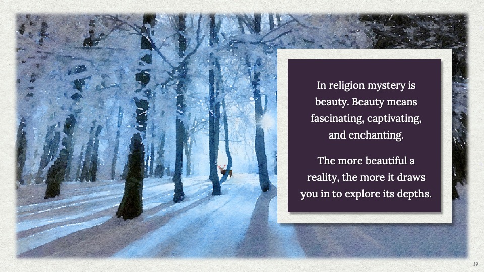
Mystery
A striking winter woodland canvas creates an emotional resonance chamber for the audience. The dark, centered text card arrives with intention, ensuring listeners lock onto the speaker’s voice rather than reading ahead.
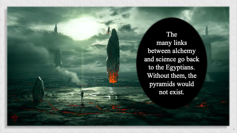
Alchemy
This slide pairs an evocative, high-contrast landscape with a centered typography cluster to ground complex intellectual transitions. By avoiding standard corporate data metrics, the artwork frames change and innovation as a profound, transformative process rather than a sterile business calculation.

Plato
This slide demonstrates the power of a vast, high-concept visual canvas to explore timeless intellectual themes. The striking, dreamlike blue artwork commands attention, while the off-center circular text box acts as a clean focal point that invites deep thought without competing with the speaker’s narrative flow.
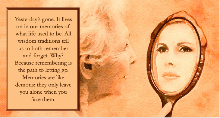
Memory
This design uses warm, artistic sepia tones and an elegant mirror metaphor to guide an audience through deep historical or biographical reflection. The structured text block functions as an artistic frame, visually slowing down the presentation rhythm to encourage contemplation and emotional resonance.
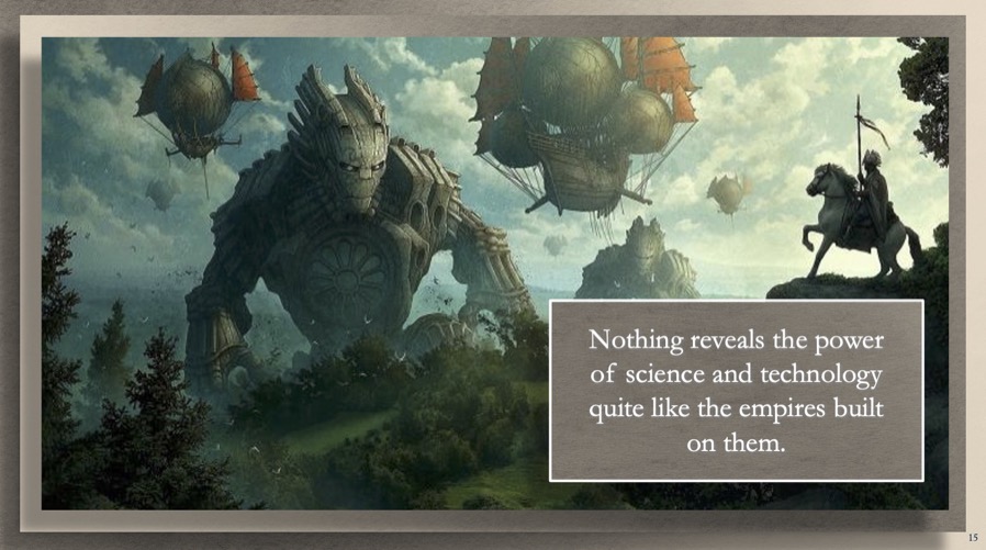
Empire
This layout combines cinematic fantasy artwork with a sharp, high-contrast text card to establish a commanding atmosphere of scale and ambition. The clean layout forces absolute visual discipline, demonstrating that even the most grand, sweeping macro-concepts are best delivered through single, uncrowded thoughts.
Prayer
This design pairs a soft, minimalist winter backdrop with a sharp diamond text container to create a layout of pure focus and clarity. The deliberate use of negative space around the central visual key mirrors the stillness required for high-stakes focus, honoring the listener’s intelligence.

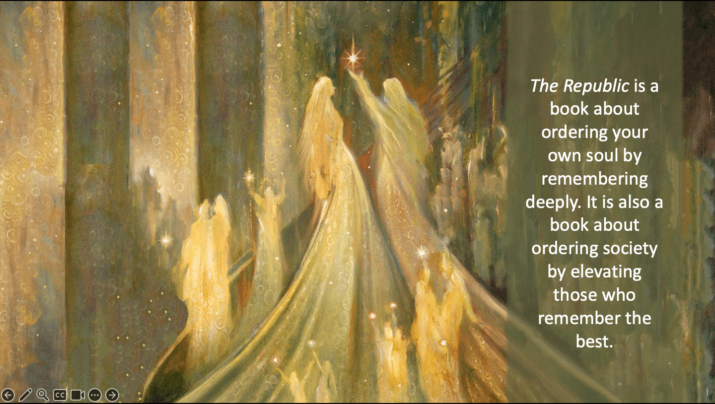
Republic
This layout leans on rich, classical fine art textures to inject immediate historical prestige and narrative depth into the presentation. The geometric text block frames the conceptual summary cleanly against the background, turning a standard educational slide into a memorable theatrical experience.
Lao-Tzu
This slide utilizes a soothing, natural landscape to ease cognitive fatigue and open the audience’s mind to strategic philosophies. The delicate, left-aligned typography acts as a quiet guide, proving that poetic layout pacing can establish profound authority far better than aggressive bullet points.


Powerless
This layout showcases a cinematic, full-bleed winter landscape to ground a profound philosophical thought. The cleanly bordered, midnight-blue text creates a strong asymmetrical balance without blocking the light reflection on the river. This layout lets the vast scenery set a deep mood of perspective and scale, letting the quote serve as a quiet guide for the listener.
Law
This layout combines an ornate, fine-art background with a luminous circular text frame to emphasize beauty and creation. The soft white outer glow around the central text block safely separates the complex typography from the rich watercolor textures beneath it. This ensures absolute clarity for the core message without sacrificing visual elegance.


Wisdom Tree
his design utilizes a vivid, natural forest canopy to frame allegorical or growth-focused narratives. By positioning a crisp, full-bleed horizontal text block along the lower baseline, the layout creates a grounded visual foundation. This ensures the audience can absorb the conceptual text naturally while remaining immersed in the quiet, atmospheric watercolor imagery.

Solomon
This slide demonstrates an excellent use of deep, cooler tones to communicate a sharp shift into historical or psychological conflict. The strong, vertical midnight blue banner on the left frames the narrative text like a formal chapter margin. This layout choice deploys ample negative space, setting a contemplative, serious mood before the speaker begins details.
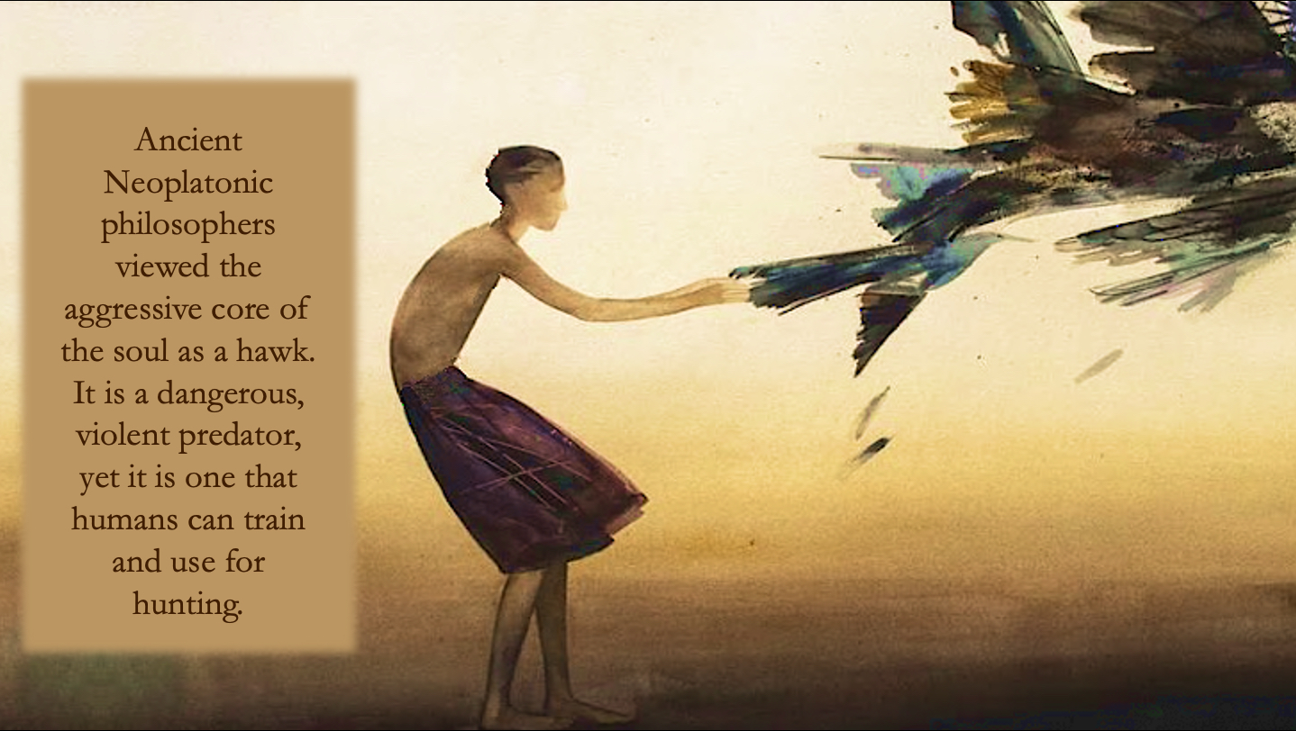
Hawk
This design relies on a striking, narrative watercolor canvas to ground a profound philosophical exploration of human nature. By using an allegorical visual focal point instead of dry, text-heavy conceptual frameworks, the layout bypasses intellectual resistance. It invites deep audience contemplation while letting the speaker’s spoken narrative guide the core lesson.

Pharmakeia
This slide pairs high-contrast dark textures with an intense crimson circular text mask to emphasize a serious thematic transition. The off-center, curved layout creates a powerful asymmetrical balance. This design choice isolates critical conceptual definitions, keeping the audience emotionally locked onto the gravity of the speaker’s words.
Potter
This layout uses a bold vertical column split to establish an immediate sense of craftsmanship and transformation. By placing the narrative text inside a rich, solid clay-toned block, the design mirrors the structure of a premium art gallery brief. It allows the audience to contrast the conceptual rule side-by-side with the warm watercolor image.